円グラフ (Pie Chart)
まず,円グラフの作成からスタートしてみよう.
円グラフを描いてみる
Google Charts の Quick Start のページにあるソースコードをそのままコピーして index.html ファイルを作成する.その後,数行を追加,編集するだけである.(サンプルを見る)
index.html
<!DOCTYPE html>
<html lang="ja">
<head>
<meta charset="utf-8">
<title>Google Charts</title>
<!--Load the AJAX API-->
<script type="text/javascript" src="https://www.gstatic.com/charts/loader.js"></script>
<script type="text/javascript">
// Load the Visualization API and the corechart package.
google.charts.load('current', {'packages':['corechart'], 'language': 'ja'});
// Set a callback to run when the Google Visualization API is loaded.
google.charts.setOnLoadCallback(drawChart);
// Callback that creates and populates a data table,
// instantiates the pie chart, passes in the data and
// draws it.
function drawChart() {
// Create the data table.
var data = new google.visualization.DataTable();
data.addColumn('string', 'Topping');
data.addColumn('number', 'Slices');
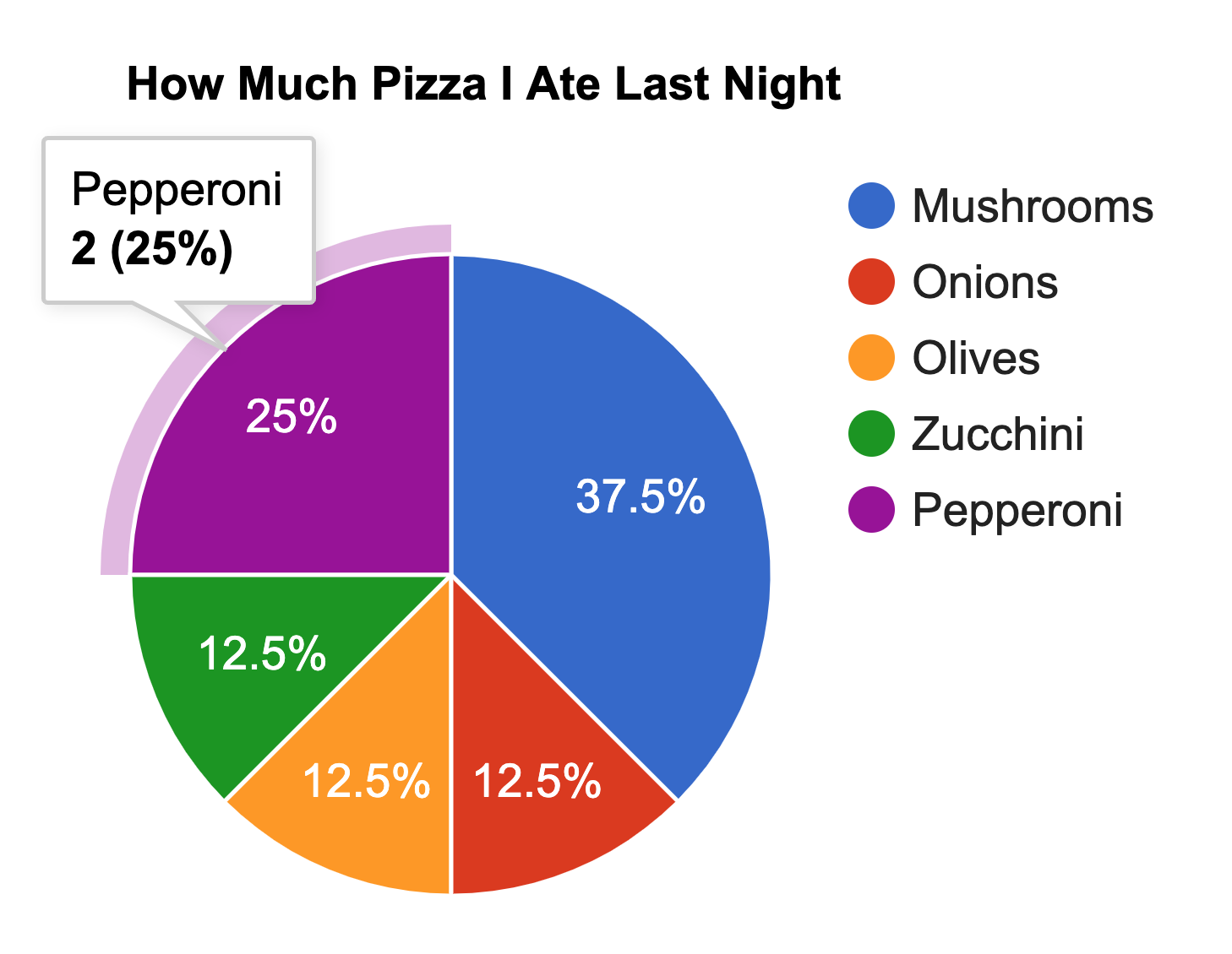
data.addRows([
['Mushrooms', 3],
['Onions', 1],
['Olives', 1],
['Zucchini', 1],
['Pepperoni', 2]
]);
// Set chart options
var options = {'title':'How Much Pizza I Ate Last Night',
'width':400,
'height':300};
// Instantiate and draw our chart, passing in some options.
var chart = new google.visualization.PieChart(document.getElementById('chart_div'));
chart.draw(data, options);
}
</script>
</head>
<body>
<!--Div that will hold the pie chart-->
<div id="chart_div"></div>
</body>
</html>
上のコードの表示結果は次のようになる.このとき,グラフ上にマウスをポイントすると情報ウィンドウが表示されることも確認しよう.

オプションを変更してみる
オプションを変更してみよう.具体的には凡例を左に移動し,グラフを3Dに変更する.なお,オプションに関する説明は https://developers.google.com/chart/interactive/docs/gallery/piechart#Configuration_Options を参照してください.(サンプルを見る)
index.html
<!DOCTYPE html>
<html lang="ja">
<head>
<meta charset="utf-8">
<title>Google Charts</title>
<!--Load the AJAX API-->
<script type="text/javascript" src="https://www.gstatic.com/charts/loader.js"></script>
<script type="text/javascript">
// Load the Visualization API and the corechart package.
google.charts.load('current', {'packages':['corechart'], 'language': 'ja'});
// Set a callback to run when the Google Visualization API is loaded.
google.charts.setOnLoadCallback(drawChart);
// Callback that creates and populates a data table,
// instantiates the pie chart, passes in the data and
// draws it.
function drawChart() {
// Create the data table.
var data = new google.visualization.DataTable();
data.addColumn('string', 'Topping');
data.addColumn('number', 'Slices');
data.addRows([
['Mushrooms', 3],
['Onions', 1],
['Olives', 1],
['Zucchini', 1],
['Pepperoni', 2]
]);
// Set chart options
var options = {'legend':'left',
'title':'3Dの円グラフに変更する',
'is3D':true,
'width':400,
'height':300};
// Instantiate and draw our chart, passing in some options.
var chart = new google.visualization.PieChart(document.getElementById('chart_div'));
chart.draw(data, options);
}
</script>
</head>
<body>
<!--Div that will hold the pie chart-->
<div id="chart_div"></div>
</body>
</html>

次に,背景色を変更し,グラフの一部を切り出し,色も変更してみよう.このとき,グラフ要素の番号は 0 からスタートすることに注意する.(サンプルを見る)
index.html(抜粋)
// Set chart options
var options = {'title':'色の変更と切り出し',
'backgroundColor':'#C0C0C0',
'is3D':true,
'slices':{ 1:{offset:0.2},
3:{offset:0.5, color:'white'},
},
'width':400,
'height':300};
