横棒グラフ (Bar Chart)
ここでは,横棒グラフを作成してみる.詳細は https://developers.google.com/chart/interactive/docs/gallery/barchart で確認できる.
横棒グラフを描いてみる
(サンプルを見る)
index.html
<!DOCTYPE html>
<html lang="ja">
<head>
<meta charset="utf-8">
<title>Google Charts</title>
<!--Load the AJAX API-->
<script type="text/javascript" src="https://www.gstatic.com/charts/loader.js"></script>
<script type="text/javascript">
// Load the Visualization API and the corechart package.
google.charts.load('current', {'packages':['corechart','bar'], 'language': 'ja'});
// Set a callback to run when the Google Visualization API is loaded.
google.charts.setOnLoadCallback(drawChart);
// Callback that creates and populates a data table,
// instantiates the pie chart, passes in the data and
// draws it.
function drawChart() {
// Create the data table.
var data = google.visualization.arrayToDataTable([
['City', '2010 Population',],
['New York City, NY', 8175000],
['Los Angeles, CA', 3792000],
['Chicago, IL', 2695000],
['Houston, TX', 2099000],
['Philadelphia, PA', 1526000]
]);
// Set chart options
var options = {
title: 'Population of Largest U.S. Cities',
chartArea: {width: '50%'},
hAxis: {
title: 'Total Population',
minValue: 0
},
vAxis: {
title: 'City'
}
};
// Instantiate and draw our chart, passing in some options.
var chart = new google.visualization.BarChart(document.getElementById('chart_div'));
chart.draw(data, options);
}
</script>
</head>
<body>
<!--Div that will hold the pie chart-->
<div id="chart_div"></div>
</body>
</html>

オプションを指定する
凡例は削除し,幅と高さを変更する.さらにアニメーションも付けてみよう.なお,アニメーションの duration はミリ秒単位で指定する.動き方(速度の変化) easing には linear,in,out,inAndOut を指定することができる.(サンプルを見る)
index.html(抜粋)
// Set chart options
var options = {
title: 'Population of Largest U.S. Cities',
// chartArea: {width: '50%'},
hAxis: {
title: 'Total Population',
minValue: 0
},
vAxis: {
title: 'City'
},
legend:{position:'none'},
width:800,
height:500,
animation:{
startup:true,
duration:1000,
// easing:'linear', // 一定のスピード
// easing:'in', // ゆっくりスタートし,加速
// easing:'out', // 速くスタートし,減速
easing:'inAndOut', // ゆっくりスタート,加速,その後減速
}
};

積み上げグラフ
積み上げグラフにするためには,isStacked: true を指定すれば良い.(サンプルを見る)
index.html(抜粋)
// Create the data table.
var data = google.visualization.arrayToDataTable([
['Genre', 'Fantasy & Sci Fi', 'Romance',
'Mystery/Crime', 'General', 'Western',
'Literature', { role: 'annotation' } ],
['2010', 10, 24, 20, 32, 18, 5, ''],
['2020', 16, 22, 23, 30, 16, 9, ''],
['2030', 28, 19, 29, 30, 12, 13, '']
]);
// Set chart options
var options = {
width: 600,
height: 400,
legend: { position: 'top', maxLines: 3 },
bar: { groupWidth: '75%' },
isStacked: true
};

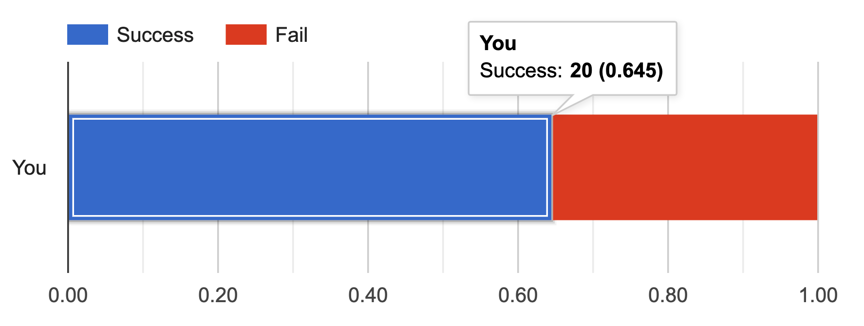
なお,isStacked オプションには,isStacked: 'percent',isStacked: 'relative',isStacked: 'absolute' がある.isStacked: 'absolute' は isStacked: true と等価である.(percentのサンプルを見る)(relativeのサンプルを見る)
index.html(抜粋)
// Create the data table.
var data = google.visualization.arrayToDataTable([
['Name','Success', 'Fail'],
['You', 20, 11]
]);
// Set chart options
var options = {
width: 600,
height: 200,
legend: { position: 'top', maxLines: 3 },
bar: { groupWidth: '50%' },
isStacked: 'percent'
};

index.html(抜粋)
// Create the data table.
var data = google.visualization.arrayToDataTable([
['Name','Success', 'Fail'],
['You', 20, 11]
]);
// Set chart options
var options = {
width: 600,
height: 200,
legend: { position: 'top', maxLines: 3 },
bar: { groupWidth: '50%' },
isStacked: 'relative'
};