複数のグラフを1ページに表示する
ここで,一つのページに複数のグラフを配置する方法を確認しておく.(サンプルを見る)
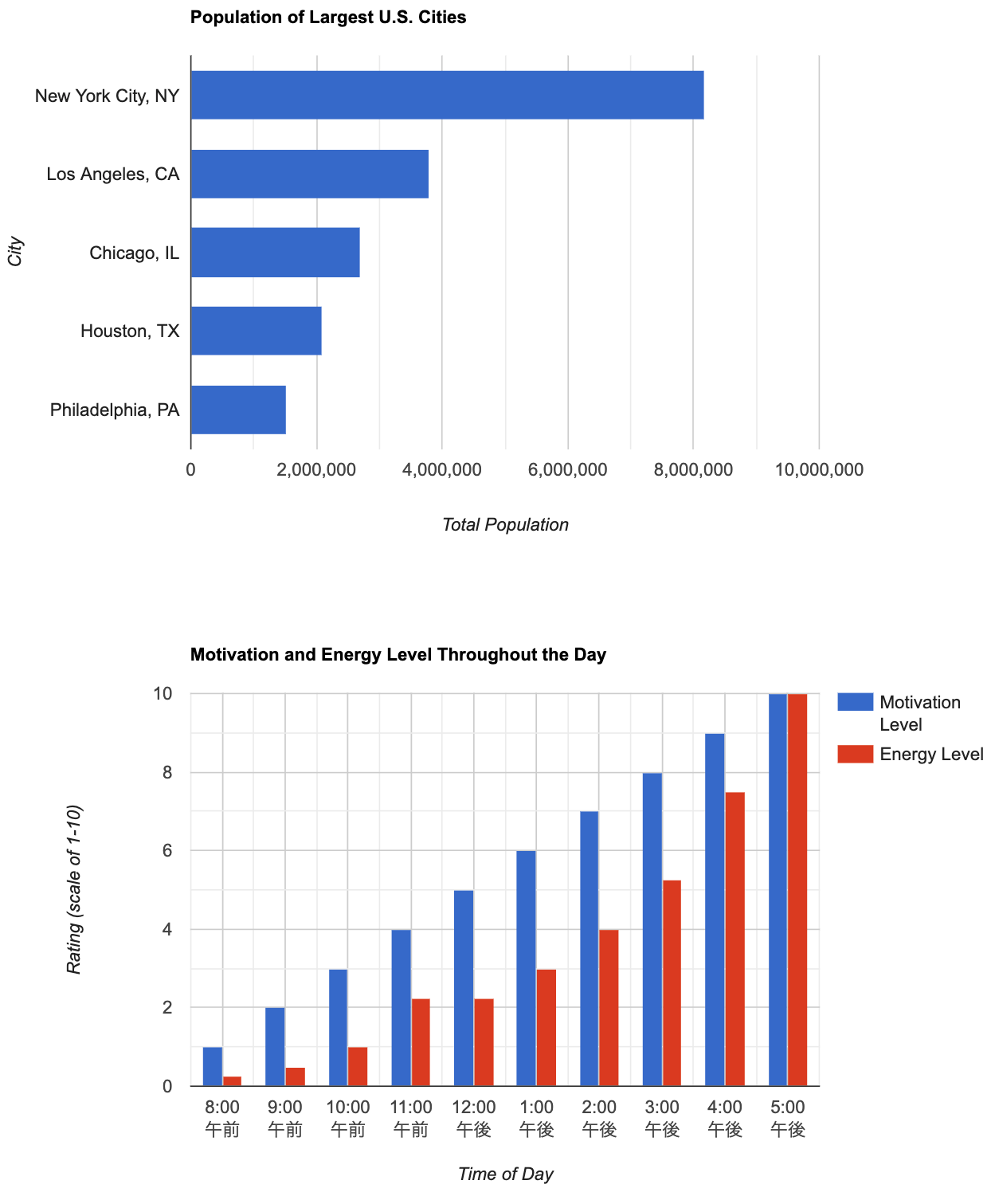
まず,113行目のようにグラフを表示するための <div> 要素を追加し,2つの <div> 要素の id をそれぞれ設定する.次にこれまでの例で使用した drawChart() 関数を24行目と64行目のように配置し,関数名をそれぞれ drawChartA(),drawChartB() のように設定する.またそれぞれの中でグラフを表示する <div> 要素のIDを指定する(60, 104行目).さらに,14行目のようにコールバック関数の名前を変更し,19行目のようにその関数を作って,その中から drawChartA(),drawChartB() を呼び出せば良い.
index.html
<!DOCTYPE html>
<html lang="ja">
<head>
<meta charset="utf-8">
<title>Google Charts</title>
<!--Load the AJAX API-->
<script type="text/javascript" src="https://www.gstatic.com/charts/loader.js"></script>
<script type="text/javascript">
// Load the Visualization API and the corechart package.
google.charts.load('current', {'packages':['corechart','bar'], 'language': 'ja'});
// Set a callback to run when the Google Visualization API is loaded.
google.charts.setOnLoadCallback(drawCharts);
// Callback that creates and populates a data table,
// instantiates the pie chart, passes in the data and
// draws it.
function drawCharts() {
drawChartA();
drawChartB();
}
function drawChartA() {
// Create the data table.
var data = google.visualization.arrayToDataTable([
['City', '2010 Population',],
['New York City, NY', 8175000],
['Los Angeles, CA', 3792000],
['Chicago, IL', 2695000],
['Houston, TX', 2099000],
['Philadelphia, PA', 1526000]
]);
// Set chart options
var options = {
title: 'Population of Largest U.S. Cities',
// chartArea: {width: '50%'},
hAxis: {
title: 'Total Population',
minValue: 0
},
vAxis: {
title: 'City'
},
legend:{position:'none'},
width:800,
height:500,
animation:{
startup:true,
duration:1000,
// easing:'linear', // 一定のスピード
// easing:'in', // ゆっくりスタートし,加速
// easing:'out', // 速くスタートし,減速
easing:'inAndOut', // ゆっくりスタート,加速,その後減速
}
};
// Instantiate and draw our chart, passing in some options.
var chart = new google.visualization.BarChart(document.getElementById('chartA_div'));
chart.draw(data, options);
}
function drawChartB() {
// Create the data table.
var data = new google.visualization.DataTable();
data.addColumn('timeofday', 'Time of Day');
data.addColumn('number', 'Motivation Level');
data.addColumn('number', 'Energy Level');
data.addRows([
[{v: [8, 0, 0], f: '8 am'}, 1, .25],
[{v: [9, 0, 0], f: '9 am'}, 2, .5],
[{v: [10, 0, 0], f:'10 am'}, 3, 1],
[{v: [11, 0, 0], f: '11 am'}, 4, 2.25],
[{v: [12, 0, 0], f: '12 pm'}, 5, 2.25],
[{v: [13, 0, 0], f: '1 pm'}, 6, 3],
[{v: [14, 0, 0], f: '2 pm'}, 7, 4],
[{v: [15, 0, 0], f: '3 pm'}, 8, 5.25],
[{v: [16, 0, 0], f: '4 pm'}, 9, 7.5],
[{v: [17, 0, 0], f: '5 pm'}, 10, 10],
]);
// Set chart options
var options = {
title: 'Motivation and Energy Level Throughout the Day',
focusTarget: 'category',
width:800,
height:500,
hAxis: {
title: 'Time of Day',
format: 'h:mm a',
viewWindow: {
min: [7, 30, 0],
max: [17, 30, 0]
},
},
vAxis: {
title: 'Rating (scale of 1-10)',
}
};
// Instantiate and draw our chart, passing in some options.
var chart = new google.visualization.ColumnChart(document.getElementById('chartB_div'));
chart.draw(data, options);
}
</script>
</head>
<body>
<!--Div that will hold the pie chart-->
<div id="chartA_div"></div>
<div id="chartB_div"></div>
</body>
</html>