縦棒グラフ (Column Chart)
ここでは,縦棒グラフを作成してみる.詳細は https://developers.google.com/chart/interactive/docs/gallery/columnchart で確認できる.
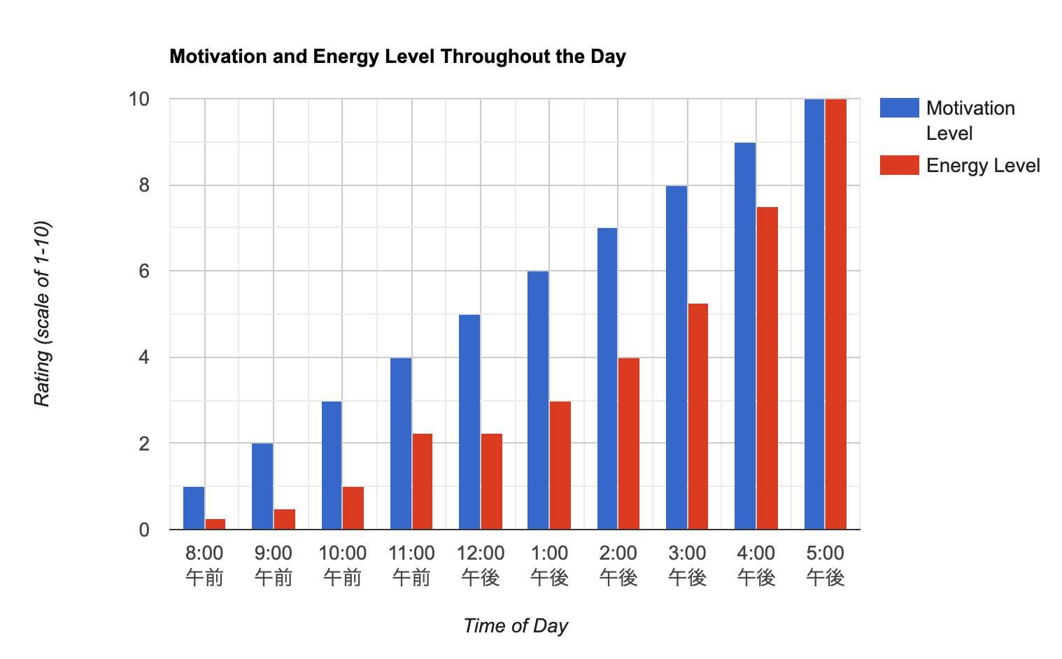
縦棒グラフを描いてみる
(サンプルを見る)
index.html
<!DOCTYPE html>
<html lang="ja">
<head>
<meta charset="utf-8">
<title>Google Charts</title>
<!--Load the AJAX API-->
<script type="text/javascript" src="https://www.gstatic.com/charts/loader.js"></script>
<script type="text/javascript">
// Load the Visualization API and the corechart package.
google.charts.load('current', {'packages':['corechart','bar'], 'language': 'ja'});
// Set a callback to run when the Google Visualization API is loaded.
google.charts.setOnLoadCallback(drawChart);
// Callback that creates and populates a data table,
// instantiates the pie chart, passes in the data and
// draws it.
function drawChart() {
// Create the data table.
var data = new google.visualization.DataTable();
data.addColumn('timeofday', 'Time of Day');
data.addColumn('number', 'Motivation Level');
data.addColumn('number', 'Energy Level');
data.addRows([
[{v: [8, 0, 0], f: '8 am'}, 1, .25],
[{v: [9, 0, 0], f: '9 am'}, 2, .5],
[{v: [10, 0, 0], f:'10 am'}, 3, 1],
[{v: [11, 0, 0], f: '11 am'}, 4, 2.25],
[{v: [12, 0, 0], f: '12 pm'}, 5, 2.25],
[{v: [13, 0, 0], f: '1 pm'}, 6, 3],
[{v: [14, 0, 0], f: '2 pm'}, 7, 4],
[{v: [15, 0, 0], f: '3 pm'}, 8, 5.25],
[{v: [16, 0, 0], f: '4 pm'}, 9, 7.5],
[{v: [17, 0, 0], f: '5 pm'}, 10, 10],
]);
// Set chart options
var options = {
title: 'Motivation and Energy Level Throughout the Day',
focusTarget: 'category',
width:800,
height:500,
hAxis: {
title: 'Time of Day',
format: 'h:mm a',
viewWindow: {
min: [7, 30, 0],
max: [17, 30, 0]
},
},
vAxis: {
title: 'Rating (scale of 1-10)',
}
};
// Instantiate and draw our chart, passing in some options.
var chart = new google.visualization.ColumnChart(document.getElementById('chart_div'));
chart.draw(data, options);
}
</script>
</head>
<body>
<!--Div that will hold the pie chart-->
<div id="chart_div"></div>
</body>
</html>
オプションを指定する
次に,縦軸・横軸や軸ラベルのフォントなどを変更してみよう. (サンプルを見る)
index.html(抜粋)
// Set chart options
var options = {
title: 'Motivation and Energy Level Throughout the Day',
focusTarget: 'category',
width:800,
height:500,
hAxis: {
title: 'Time of Day',
format: 'h:mm a',
viewWindow: {
min: [7, 30, 0],
max: [17, 30, 0]
},
textStyle: {
fontSize: 14,
color: '#053061',
bold: true,
italic: false
},
titleTextStyle: {
fontSize: 18,
color: '#053061',
bold: true,
italic: false
}
},
vAxis: {
title: 'Rating (scale of 1-10)',
textStyle: {
fontSize: 18,
color: '#67001f',
bold: false,
italic: false
},
titleTextStyle: {
fontSize: 18,
color: '#67001f',
bold: true,
italic: false
}
}
};
