HTML 入門
スタイルシートでデザインを作ろう
図のデザインを設定する
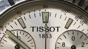
ここではページ内に埋め込んだ図や写真のスタイリングを行います.まず,スタイルを適用せずに写真を埋め込むと次のようになります.
index.html(抜粋)
<p>
<img src="tissot.png" width="284" height="160" alt="tissot">
</p>
ブラウザでの表示結果
次に .img1 クラスを付けた写真については border-radius プロパティを使って角を丸めてみます.
index.html(抜粋)
<p>
<img src="tissot.png" width="284" height="160" alt="tissot" class="img1">
</p>
style.css(抜粋)
.img1 {
border-radius: 16px;
}
ブラウザでの表示結果
続いて .img2 クラスには 5px のグレー (#808080) で実線の枠線を付けてみます.
index.html(抜粋)
<p>
<img src="tissot.png" width="284" height="160" alt="tissot" class="img2">
</p>
style.css(抜粋)
.img2 {
border: 5px solid #808080;
}
ブラウザでの表示結果
背景に影をつけて立体感を出す処理を行います.まず準備として .img3 クラスには box-shadow プロパティで半透明の黒い影を付けます.この影は横方向に 20px,縦方向に 50px だけずらし,影のぼかし距離を 0 にします.画像と同じサイズの影が生成され,指定した距離だけ右下方向に移動していることがわかります.
index.html(抜粋)
<p>
<img src="tissot.png" width="284" height="160" alt="tissot" class="img3">
</p>
style.css(抜粋)
.img3 {
box-shadow: 20px 50px 0 rgba(0, 0, 0, 0.4);
}
ブラウザでの表示結果
上で付けた影にぼかしを入れます..img4 クラスではぼかし距離を 0 から 10px に変更しました.すると影の周囲に僅かなぼかしが入っていることが確認できると思います.
index.html(抜粋)
<p>
<img src="tissot.png" width="284" height="160" alt="tissot" class="img4">
</p>
style.css(抜粋)
.img4 {
box-shadow: 20px 50px 10px rgba(0, 0, 0, 0.4);
}
ブラウザでの表示結果
影の移動距離を短くします.具体的には横方向,縦方向ともに 5px に変更すると次のような結果になりました.僅かな影の存在によってイメージに立体感が得られたのではないでしょうか.
index.html(抜粋)
<p>
<img src="tissot.png" width="284" height="160" alt="tissot" class="img5">
</p>
style.css(抜粋)
.img5 {
box-shadow: 5px 5px 10px rgba(0, 0, 0, 0.4);
}
ブラウザでの表示結果
ぼかしを入れて角を丸くすることも可能です.
index.html(抜粋)
<p>
<img src="tissot.png" width="284" height="160" alt="tissot" class="img6">
</p>
style.css(抜粋)
.img6 {
box-shadow: 5px 5px 10px rgba(0, 0, 0, 0.4);
border-radius: 16px;
}
ブラウザでの表示結果